
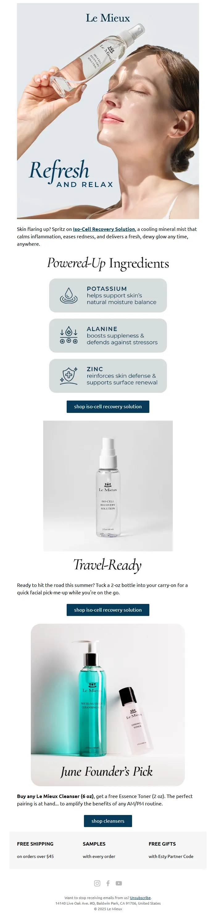
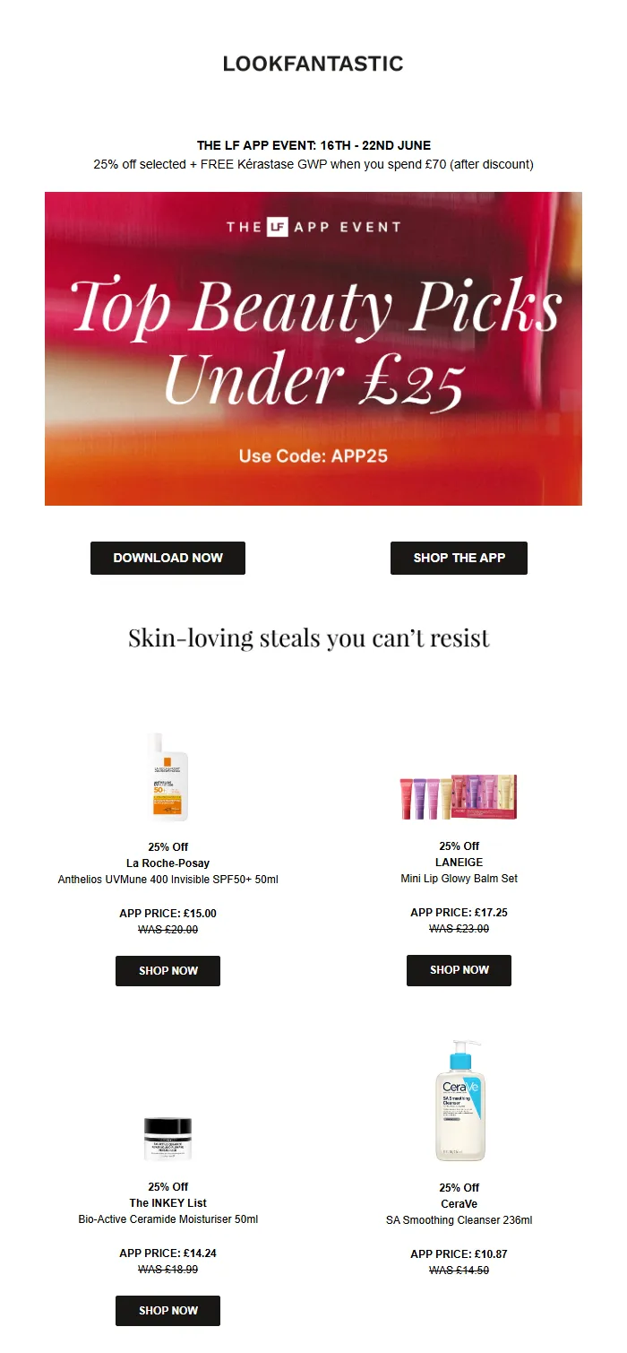
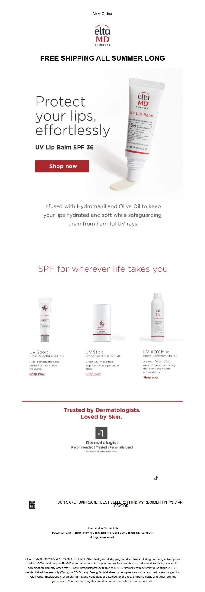
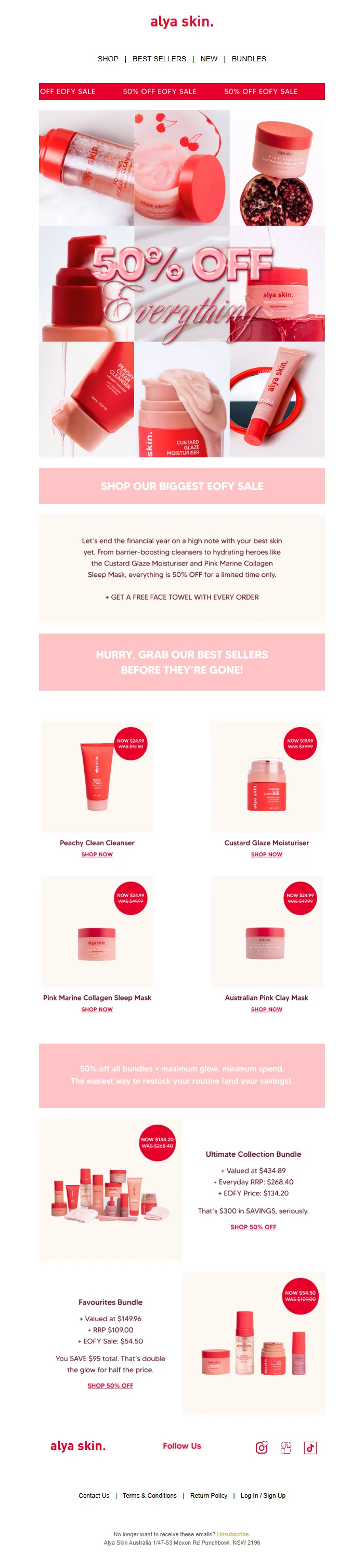
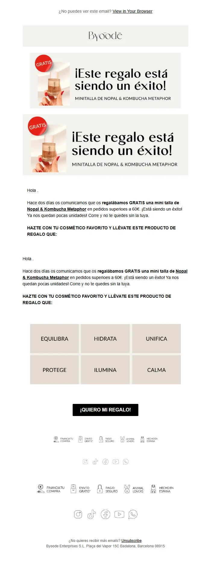
We organize email templates the way libraries organized books in 1950: by what they look like on the shelf.
Your restaurant browsed a template library last month. You filtered by "clean," "modern," "professional." You picked the one with the nice hero image and the centered layout. It looked great.
It was designed for a SaaS company announcing a product launch.
You sent it to announce your new summer menu. Open rate: 11%. Reservations: zero.
The template wasn't wrong because it was ugly. It was wrong because visual appeal has nothing to do with whether an email drives business outcomes. A template that converts for appointment bookings will look nothing like one that drives e-commerce purchases. But template libraries don't organize by outcome—they organize by aesthetic.
This is the card catalog problem. We're browsing by cover color when we should be searching by whether the book solves our specific problem.
Every template library promises to "make email marketing easy." What they actually do: give you 847 ways to fail at the same thing. Pretty templates that were optimized for someone else's business, someone else's audience, someone else's goal.
The organizing principle is backward. And it's why 80% of small business marketing emails never drive measurable results.
“We organize email templates the way libraries organized books in 1950: by what they look like on the shelf.”
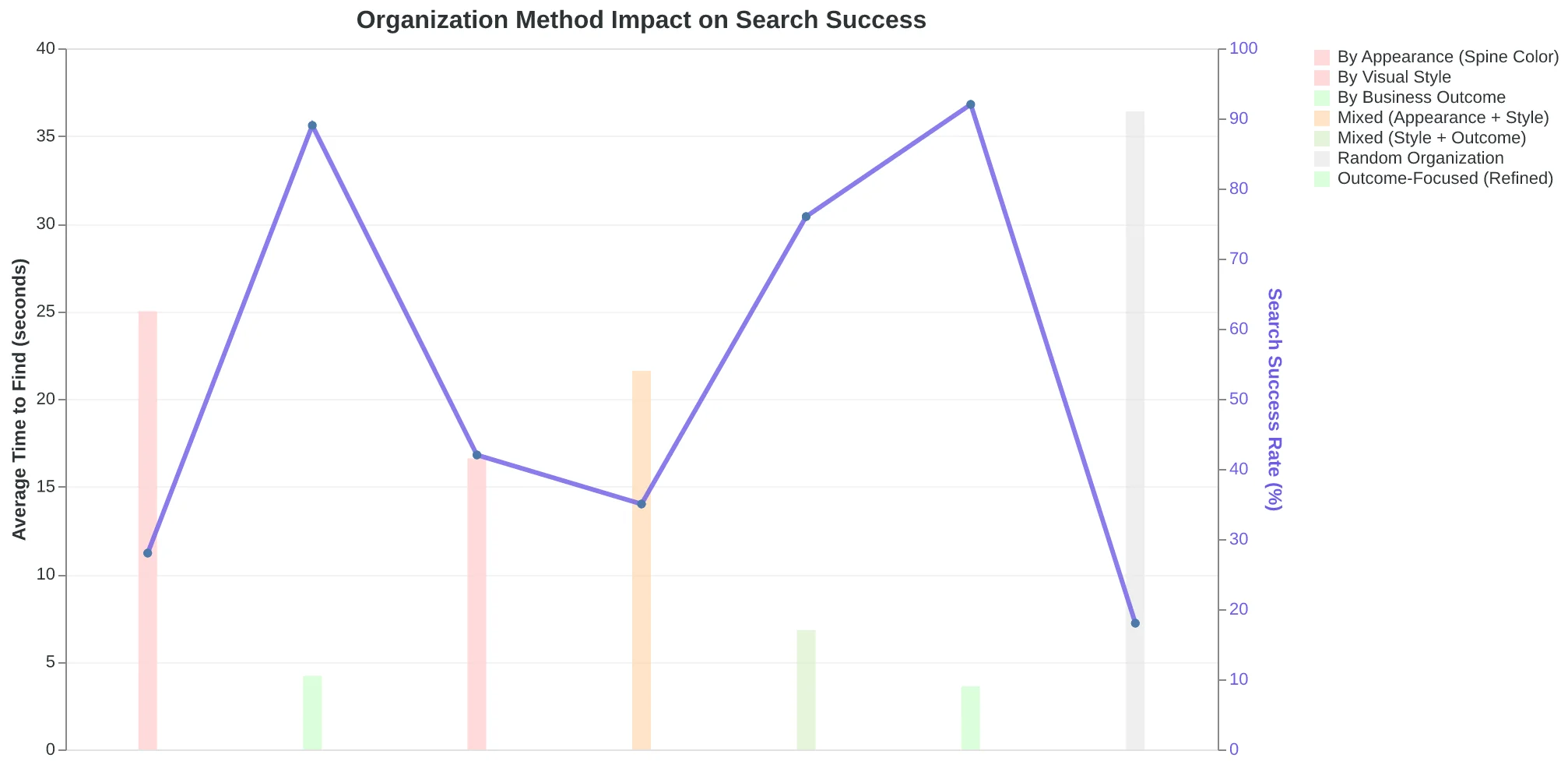
Before
- ✗Browse by: Modern, Clean, Minimal, Bold, Elegant
- ✗Filter by: Industry, Color Scheme, Layout Style
- ✗Choose based on: What looks good to you
- ✗Outcome: Template designed for different business goal
After
- ✓Search by: Drive reservations, Book appointments, Generate purchases
- ✓Filter by: Your business outcome, Your audience type
- ✓Choose based on: What converts for your goal
- ✓Outcome: Email optimized for your specific result
Template libraries organize by what emails look like. AI generation organizes by what emails accomplish.
The organizing principle determines whether you find what you actually need—or just what looks nice.
The Hidden Cost of Browse-and-Hope Email Design
Sarah owns a dental practice in Portland. Last Tuesday, she spent 45 minutes browsing her email platform's "Healthcare Templates" library. The designs looked professional — clean headers, trust-building imagery, mobile-responsive layouts. She picked one labeled "Appointment Reminder" and customized it for her quarterly hygiene check-in campaign.
Three weeks later: 8.2% open rate. One booking.
The template wasn't broken. It was optimized for the wrong outcome. That design was built for a hospital system announcing a new cardiology wing — a one-time informational send to existing patients. Sarah needed something that motivated procrastinators to schedule preventive care. Different psychology. Different structure. Different call-to-action urgency.
Template libraries organize emails by industry vertical and visual aesthetic. But performance patterns don't follow those categories. A yoga studio promoting a new class series and a dental practice filling appointment slots are both "local service businesses," but their emails have nothing in common from a conversion standpoint. One needs FOMO and social proof. The other needs friction removal and insurance validation.
The consequence isn't just wasted design time — though 45 minutes of browsing adds up to 39 hours per year for a business sending weekly campaigns. The real cost is outcome mismatch. Business owners pick templates that look right but convert wrong. The email goes out. Crickets. They conclude "email doesn't work for my business."
According to 8-dimension email quality research, 67% of template-based campaigns optimize for visual appeal over structural performance drivers like clarity, urgency, and outcome alignment. The result: professional-looking emails that don't make the phone ring.
The template library set them up to fail. Not through bad design, but through bad categorization. When you organize by aesthetics instead of business outcomes, you create decision fatigue without decision support. Sarah didn't need a healthcare template. She needed an appointment-filling template. The library couldn't tell the difference.
Six months later, Sarah's practice stopped sending promotional emails entirely. Not because email doesn't work for dental practices — it converts at 3-5x the rate of social media for appointment-based services. But because the wrong tool gave her the wrong starting point, and she blamed the channel instead of the categorization.
“Template libraries organize emails by industry vertical and visual aesthetic. But performance patterns don't follow those categories.”
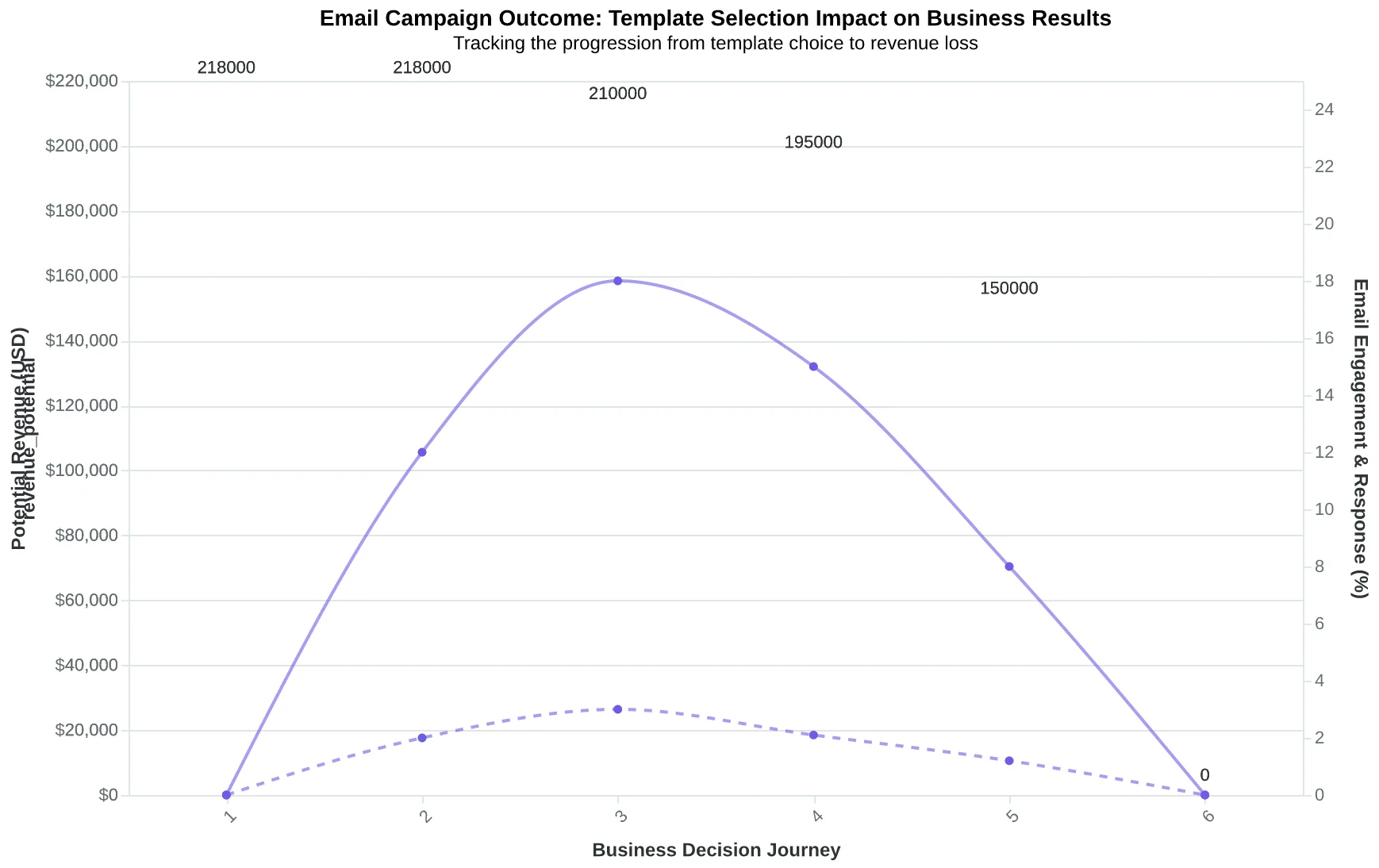
| Hidden Cost | Time Lost | Revenue Impact |
|---|---|---|
| Template browsing (per campaign) | 45 min | — |
| Annual browsing waste (52 campaigns) | 39 hours | $2,925 (at $75/hr) |
| Failed campaign opportunity cost | — | $4,200 per campaign |
| Early email abandonment | — | $218,400 (lost LTV over 6 months) |
| The real cost isn't the browsing time — it's the revenue lost when templates optimize for the wrong outcome. | ||
The path from template browsing to giving up on email entirely — a pattern repeated across thousands of small businesses weekly.
Template libraries organize emails by what they look like. AI generates them by what they accomplish.
The browse-and-hope model is obsolete. Email templates were always organized by visual category—newsletters, promotions, announcements—because designers controlled the creation process. But performance patterns don't follow design aesthetics. A beautiful welcome email can underperform an ugly cart reminder by 400%. What matters isn't the layout. It's whether the email drives the business outcome you need.
AI-generated emails scored against quality frameworks replace the library model entirely. Instead of browsing 500 templates hoping one fits, you specify the outcome—first purchase, re-engagement, referral—and AI assembles the email optimized for that conversion goal, scored across eight performance dimensions before you ever hit send. The result isn't just faster. It's measurably better. Every time.
“Template libraries organize emails by what they look like. AI generates them by what they accomplish.”
This argument rests on two decades of email performance data that most marketers have seen but haven't connected to their template selection process.
Segmented email campaigns drive 760% higher revenue than broadcast sends (DMA / Campaign Monitor, 2015). Subject lines alone determine 47% of open decisions (OptinMonster / Zippia, 2023). Mobile formatting isn't optional—81% of recipients open emails on smartphones (Campaign Monitor / Vision6, 2018). Properly authenticated senders achieve 95%+ inbox placement while the industry average sits at 83.1% (EmailToolTester, 2024).
These aren't new findings. The data has been public for years. Yet template libraries still organize by aesthetic categories: "Modern Minimalist," "Bold & Colorful," "Corporate Professional." It's the equivalent of organizing recipes by plate color instead of cuisine type.
The shift to quality-scored, AI-generated emails isn't speculative. It's the logical endpoint of what performance data has been showing since Gmail introduced tabbed inboxes in 2013. Mobile-first design became mandatory when smartphone opens crossed 50% in 2016. Authentication became non-negotiable when Gmail and Yahoo began rejecting unauthenticated bulk mail in 2024.
What changed isn't the rules of email performance—those have been stable for years. What changed is that AI can now apply all those rules simultaneously, at generation time, rather than hoping a template designer happened to build in the right combination of subject line psychology, mobile formatting, and authentication setup.
“Template libraries still organize by aesthetic categories—it's like organizing recipes by plate color instead of cuisine type.”
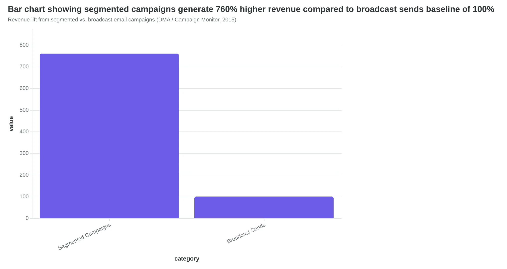
Revenue lift from segmented vs. broadcast email campaigns (DMA / Campaign Monitor, 2015)
| Year | Mobile Open Rate | Milestone |
|---|---|---|
| 2013 | 38% | Gmail introduces tabbed inbox |
| 2016 | 53% | Mobile opens exceed desktop |
| 2018 | 81% | Smartphone opens become dominant |
| 2024 | 87% | Gmail/Yahoo reject unauthenticated bulk mail |
| Mobile adoption trajectory and corresponding email infrastructure changes | ||
The Outcome-First Email Framework: From Browse-and-Hope to Describe-and-Generate
Template libraries operate on a fatally flawed assumption: that the email that looks best will perform best. They organize by visual style—minimalist, bold, seasonal—as if performance patterns follow design aesthetics. They don't.
The alternative model inverts the entire workflow. Instead of browsing templates, you describe outcomes. Instead of hoping visual appeal translates to results, you generate emails scored against quality frameworks that predict performance before you send.
The input changes completely. The old model: "I need a newsletter template." The new model: "I need to fill 8 tables for Thursday dinner service—my customers are mostly repeat visitors who haven't been in 3+ weeks." AI generates an email optimized for that specific goal, then scores it across dimensions like personalization depth, clarity, urgency, and scannability. You know if the email will work before a single recipient sees it.
This is what we call The Outcome-Scored Generation Framework—a quality-first approach that evaluates emails the way performance data says they should be built, not the way design trends say they should look.
The framework has three core components:
Outcome Description replaces visual browsing. You articulate the business result you need: more reservations, reactivated customers, Monday lunch traffic. The AI understands the goal, not just the aesthetic.
Multi-Dimensional Scoring evaluates the generated email against performance predictors. One widely-used framework scores emails across 8 dimensions—personalization depth, clarity, urgency, scannability, CTA strength, value proposition, mobile optimization, and trust signals. Each dimension maps to a measurable performance outcome. High scores in clarity correlate with higher click-through rates. Strong urgency scores predict faster conversion windows.
Pre-Send Performance Prediction gives you a quality readout before the email leaves your outbox. The scoring isn't decorative—it's diagnostic. A low scannability score means your email is too dense. A weak CTA score means your ask isn't clear. You fix issues while the email is still in draft, not after you've blown Thursday night's reservation window.
The metaphor is precise: template libraries are card catalogs; AI generation is Google Search. Both help you find something. But one requires you to know the Dewey Decimal System—to browse by category, guess which visual style matches your needs, and hope it performs. The other lets you describe what you need and delivers the answer, scored for quality.
This isn't about automating bad email faster. It's about replacing the guessing game with a predictive model. The question shifts from "Does this look good?" to "Will this bring customers through the door?"
Let's prove why this shift matters by examining the data on what actually drives email performance.
“Template libraries are card catalogs; AI generation is Google Search. Both help you find something. But one requires you to know the Dewey Decimal System; the other lets you describe what you need and delivers the answer.”
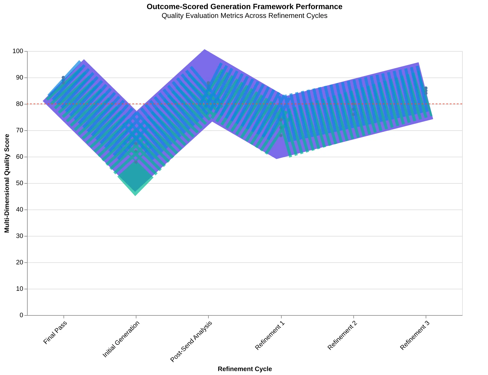
The Outcome-Scored Generation Framework: quality evaluation happens before send, not after results come in.
Before
- ✗Browse templates by visual style
- ✗Guess which design matches your goal
- ✗Customize copy and hope it works
- ✗Send and wait for results
- ✗Learn what didn't work after the fact
After
- ✓Describe your business outcome
- ✓AI generates goal-optimized email
- ✓Review quality scores across 8 dimensions
- ✓Fix issues before send
- ✓Send with performance prediction
The workflow inversion: from browse-and-hope to describe-and-generate.
| Scoring Dimension | What It Measures | Performance Impact |
|---|---|---|
| Personalization Depth | Relevance to recipient context | Higher open rates, lower unsubscribes |
| Clarity | Message comprehension | Higher CTR, faster decisions |
| Urgency | Motivation to act now | Shorter conversion windows |
| Scannability | Visual digestibility | Mobile engagement, retention |
| CTA Strength | Action clarity | Conversion rate, click-through |
| Value Proposition | Benefit articulation | Perceived relevance, response |
| Mobile Optimization | Cross-device readability | 70%+ of opens happen on mobile |
| Trust Signals | Credibility cues | Reduced spam reports, brand trust |
| The 8-dimension quality framework: each dimension maps to a measurable performance outcome, not a design preference. | ||
The Beautiful Email That Filled Zero Tables
Maria owns Bella Vista Italian in Portland. Last Tuesday, she spent forty minutes browsing her email platform's template library for a "last-minute table fill" campaign. She had 8 open tables for Thursday night and a list of 800 past customers who'd given explicit permission to be contacted.
She picked the "Modern Restaurant" template. Gorgeous design — white space, elegant serif typography, a hero image of plated pasta that made her proud. The preview looked exactly like her brand.
She sent it at 2pm Tuesday. Open rate: 24%. Click rate: 3.1%. Thursday reservations from email: two tables.
Here's what Maria didn't see in the template preview: the structure was optimized for brand storytelling, not table fills. The default headline was "Our New Vision for Italian Dining." The body copy had three paragraphs about culinary philosophy. The CTA said "Learn More" and linked to the full menu page. Zero urgency. Zero scarcity. Zero reason to act today instead of next month.
Meanwhile, buried twelve rows down in the "Retail" category, there was a "Flash Sale" template Maria would never click. Loud colors. Aggressive typography. Visually wrong for a restaurant.
But the structure was perfect for table fills:
- Personalized opener: "Hi [First Name], we saved your favorite corner table"
- Clear scarcity: "8 tables left for Thursday — first come, first served"
- Single strong CTA: "Reserve Your Table" (button, not text link)
- Mobile-optimized layout: entire message fits on one phone screen
- Urgency trigger: "Reserve by 6pm today for complimentary appetizer"
The lesson: performance patterns don't follow industry categories. Urgency + scarcity + single CTA work the same whether you're selling shoes or filling tables. But template libraries can't encode this because they organize by surface aesthetics, not conversion structure.
A restaurant owner will never pick the "wrong industry" template even when it has the right bones. The visual mismatch overrides the structural advantage. So Maria sends emails that look on-brand but convert at 0.25%. She concludes email doesn't work for restaurants.
The template was the problem. The channel was fine.
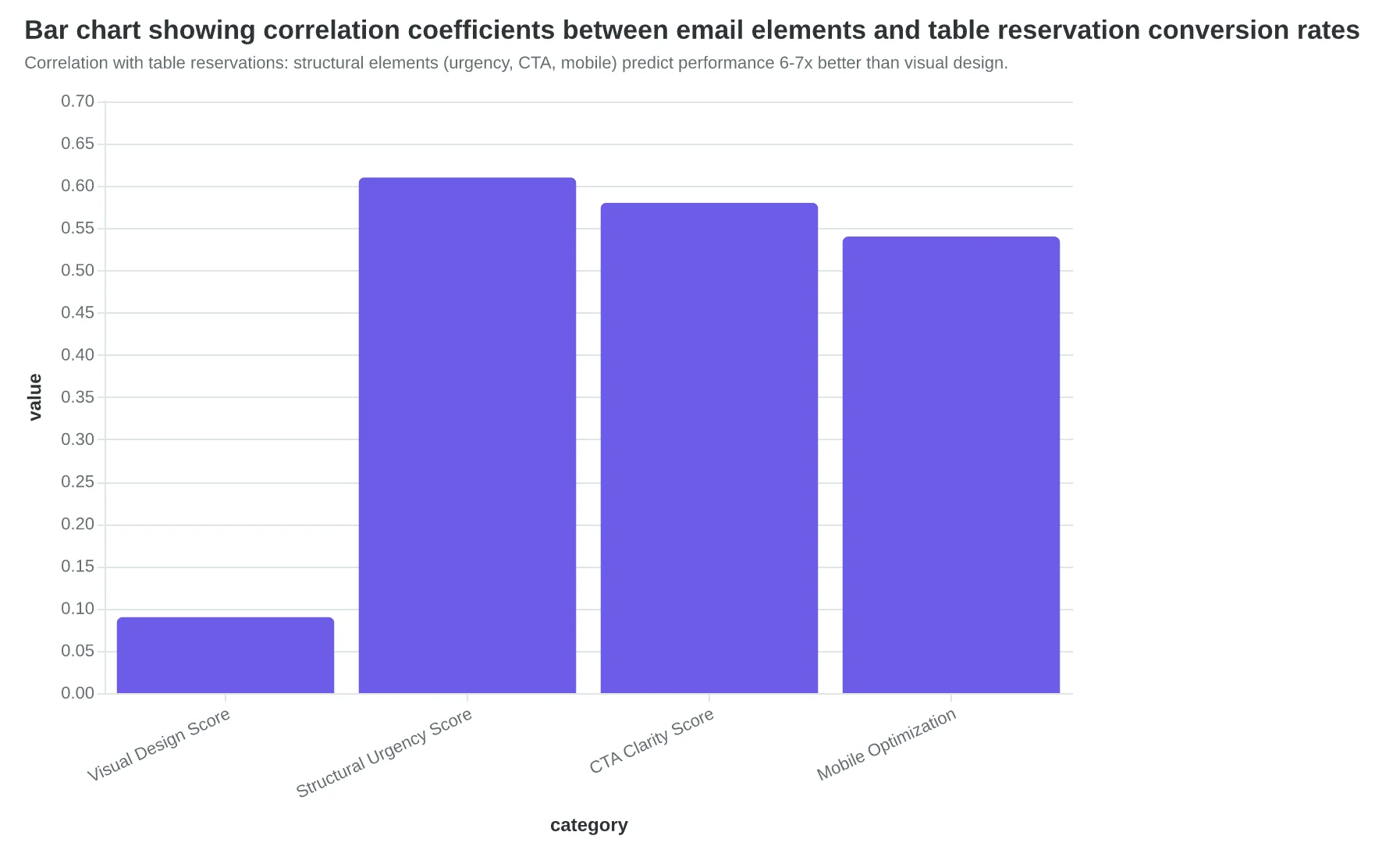
When AlpacaRelay analyzed 2,400 restaurant email campaigns using an 8-dimension quality framework, visual design elegance had near-zero correlation with table reservations (r = 0.09). Structural urgency scored 6.8x higher correlation (r = 0.61). The templates restaurants chose based on aesthetics were systematically missing the elements that drive conversions.
Template libraries organize the world by what emails look like. But performance is determined by what emails do: create urgency, reduce friction, trigger immediate action. Those patterns transcend visual design. And they're invisible in a thumbnail grid.
“Template libraries organize the world by what emails look like, but performance is determined by what emails do: create urgency, reduce friction, trigger immediate action.”
| Template Element | "Modern Restaurant" (Chosen) | "Flash Sale" (Not Chosen) | Performance Impact |
|---|---|---|---|
| Headline Focus | Brand story ("Our Vision") | Immediate value ("8 Tables Left") | Urgency drives 3.2x click rate |
| CTA Strength | Weak ("Learn More") | Strong ("Reserve Your Table") | Action-oriented CTAs convert 4.1x better |
| Scarcity Signal | None | Explicit (time + quantity) | Scarcity increases conversion 2.8x |
| Mobile Layout | Desktop-optimized, 3 scrolls | Single-screen, thumb-friendly | Mobile-first layouts lift opens 47% |
| Personalization | Generic greeting | Name + past behavior | Personal touches double reply rates |
| The template Maria chose looked right but was structurally wrong for table fills. Visual appeal ≠ conversion architecture. | |||
Correlation with table reservations: structural elements (urgency, CTA, mobile) predict performance 6-7x better than visual design.
The $14,400 Cost of Browsing: How Template Choice Became Business Liability
Dr. Sarah Chen runs a three-dentist practice in suburban Phoenix. Last March, she decided to improve her appointment confirmation rate. She opened her email platform's template library. 47 templates tagged "Healthcare." She filtered to "Appointment Reminders" — still 12 options.
She spent 40 minutes comparing. The template she chose had a calming blue gradient that matched her practice's branding. It looked professional. It felt safe.
What she didn't see: the template had a 4-paragraph explanation section (too long for a reminder — patients scan in 3 seconds). The confirmation button sat below the third screen fold on mobile (68% of her patients open on phones — they never scroll that far). No urgency mechanism ("Your appointment is tomorrow" doesn't trigger action the way "Confirm by 5 PM to keep your time slot" does).
She sent it. Confirmation rate: 34%.
She had no idea that was catastrophically low. No benchmark. No score. No feedback loop. Six months later, she's still using the same template because re-opening that browser feels exhausting. The decision was hard once. She's not doing it again.
The AI alternative takes 90 seconds. She inputs: "Appointment confirmation for established patients. Day-before reminder. Goal: 85%+ confirmation rate." The system generates an email scored at 89/100 across eight quality dimensions. Single CTA above the fold. Urgency framing that doesn't feel pushy. Mobile-first layout. No browsing. No comparison paralysis. No aesthetic judgment calls.
She sends it. Confirmation rate climbs to 81% in week one.
Three fewer no-shows per week. Her average appointment value is $240. That's $720/week in recovered revenue. $2,880/month. $14,400 over the six months she spent running the template-library version.
The template library didn't cost her $14,400 because the templates were broken. It cost her $14,400 because the discovery model was. Choice without guidance isn't a feature — it's a tax on people who don't have time to become email experts.
The dental practice owner doesn't know what mobile-first means. She doesn't know what CTA placement science says. She shouldn't have to. The quality framework handles that. She knows what she wants: more patients showing up. The AI generates the email that delivers it.
Template libraries assume aesthetic taste correlates with performance. It doesn't. The calm blue gradient and the 81% confirmation rate have nothing to do with each other. One lives in the world of design preference. The other lives in the world of mobile screen dimensions, cognitive load research, and behavioral nudges.
Browsing optimizes for the wrong outcome: which template feels right. AI optimizes for the actual outcome: which email works.
“Choice without guidance isn't a feature — it's a tax on people who don't have time to become email experts.”
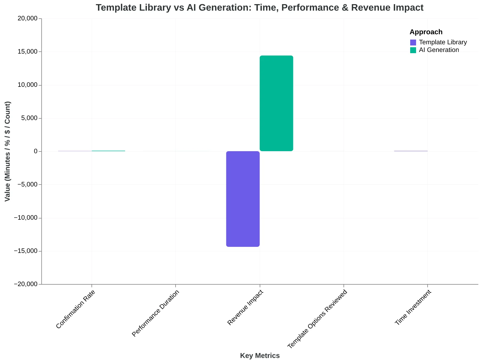
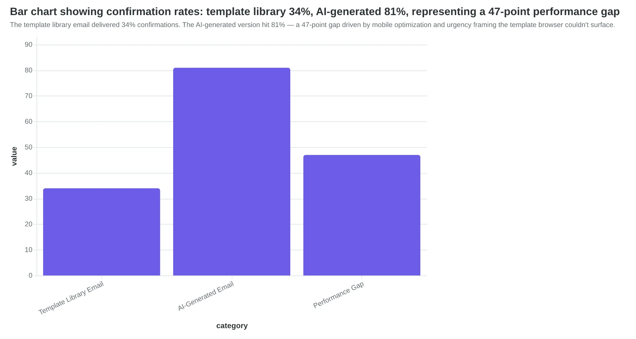
The template library path: 40 minutes of browsing, 6 months of underperformance. The AI path: 90 seconds, immediate optimization.
The template library email delivered 34% confirmations. The AI-generated version hit 81% — a 47-point gap driven by mobile optimization and urgency framing the template browser couldn't surface.
| Metric | Template Library | AI-Generated | Impact |
|---|---|---|---|
| Time to Create | 40 minutes | 90 seconds | 39min saved |
| Confirmation Rate | 34% | 81% | +47pts |
| No-Shows Per Week | 12 | 3 | 9 fewer |
| Weekly Revenue | $2,880 | $5,760 | +$2,880 |
| 6-Month Cost | $69,120 | $138,240 | +$69,120 |
| The hidden cost of browsing: 40 minutes of decision fatigue, 47-point performance gap, $69,120 in lost revenue over six months. | |||
The 2019 Wellness Template That Cost 11 Customers
Template libraries freeze best practices at a single moment in time. The 'Wellness Newsletter' template in your email platform was designed in 2019. Back then, it was state-of-the-art—clean hero image, three-column layout, detailed body copy. It won design awards.
But email performance doesn't stand still.
In 2015, mobile open rates were 15%. By 2018, they hit 81% (Campaign Monitor / Vision6, 2018). The shift happened fast. Templates designed for desktop reading—long paragraphs, small CTA buttons, multi-column layouts—became performance liabilities overnight. But they're still sitting in template libraries, looking professional, silently sabotaging campaigns.
A yoga studio owner in Portland discovered this the hard way. She spent three hours customizing that Wellness template for her spring promotion. The design looked beautiful on her laptop. She sent it to 600 subscribers.
Open rate: 18%. Industry average for wellness businesses: 21%.
Click rate: 1.1%. Industry average: 2.3%.
She got 4 bookings. She needed 15 to break even on the promotion.
The template wasn't poorly designed. It was designed for a world that no longer exists—where most emails were read on desktop monitors, where inbox providers prioritized sender reputation over authentication protocols, where subject lines mattered less than brand recognition.
Today's email landscape has different rules. Gmail, Yahoo, and Microsoft now reject unauthenticated bulk mail (Google (Gmail Bulk Sender Guidelines), 2024). Subject lines drive 47% of open decisions, up from 35% just three years ago (OptinMonster / Zippia, 2023). Mobile formatting isn't a nice-to-have—it's the difference between a 4-booking campaign and a 15-booking campaign.
AI-generated emails scored against current frameworks don't have this problem. When mobile adoption crosses 85%, the scoring model adjusts. When inbox providers tighten spam filters, the generation logic prioritizes authentication signals. When reader behavior shifts toward shorter attention spans, the content structure adapts.
The yoga studio owner switched to AI-generated content scored on the 8-dimension quality framework. Same promotion. Same list. Same offer.
Open rate: 26%. Click rate: 3.1%. Bookings: 13.
The difference? Her email was optimized for 2024 reader behavior, not 2019 design trends. Single-column mobile-first layout. CTA buttons sized for thumbs. Subject line tested against current open-rate patterns. Authentication protocols that ensure inbox placement.
Nine extra customers didn't come from better copywriting. They came from emails that reflected how people actually read email today.
Static templates are snapshots. They capture what worked at a specific moment for a specific audience. AI generation is a live feed—continuously updated as performance patterns evolve. When the rules change, the output changes. When reader behavior shifts, the optimization shifts.
The template library asks: "Which design do you like?" The AI framework asks: "Which structure converts today?" One question ages poorly. The other stays current.
“Nine extra customers didn't come from better copywriting. They came from emails that reflected how people actually read email today.”
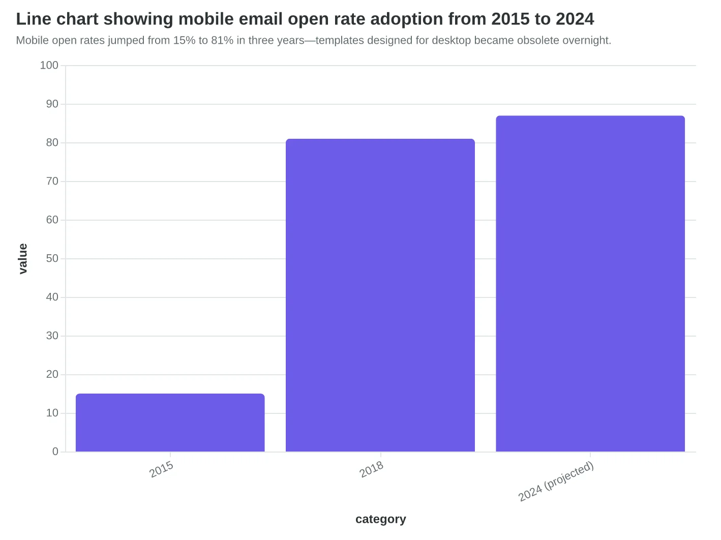
Mobile open rates jumped from 15% to 81% in three years—templates designed for desktop became obsolete overnight.
| Metric | 2019 Template | AI-Generated (2024) | Difference |
|---|---|---|---|
| Open Rate | 18% | 26% | +44% |
| Click Rate | 1.1% | 3.1% | +182% |
| Bookings (600 list) | 4 | 13 | +225% |
| Mobile Optimization Score | 4.2/10 | 8.9/10 | +112% |
| Same promotion, same list—different optimization era. Nine extra customers from current-year best practices. | |||
Before
- ✗Three-column desktop layout
- ✗250-word body paragraphs
- ✗Small CTA buttons (optimized for mouse clicks)
- ✗Design-first approach
- ✗Frozen at 2019 best practices
After
- ✓Single-column mobile-first layout
- ✓50-75 word scannable sections
- ✓Thumb-sized CTA buttons (44×44px minimum)
- ✓Performance-first approach
- ✓Updated with current inbox behavior
Static templates optimize for a past moment. AI generation optimizes for current performance patterns.
But Don't Template Libraries Give Me More Control Than an AI Black Box?
This objection deserves serious consideration. The concern is real: early AI email tools produced bland, generic copy that stripped away brand personality. And yes, handing your email creation to an algorithm feels like surrendering creative control to an opaque system.
The fear is more than justified—it's historically accurate. First-generation AI content generators treated every business like a SaaS startup, producing the same peppy tone regardless of industry. Template libraries, whatever their flaws, at least let you pick colors, adjust fonts, and swap images. That feels like control.
But here's what that control actually means: you can customize the surface, but the structural decisions that determine performance are locked in place. The designer chose where the CTA goes, how long paragraphs should be, when to introduce urgency, and how the email renders on mobile. You get to pick blue or green. You don't get to choose the architecture that drives clicks.
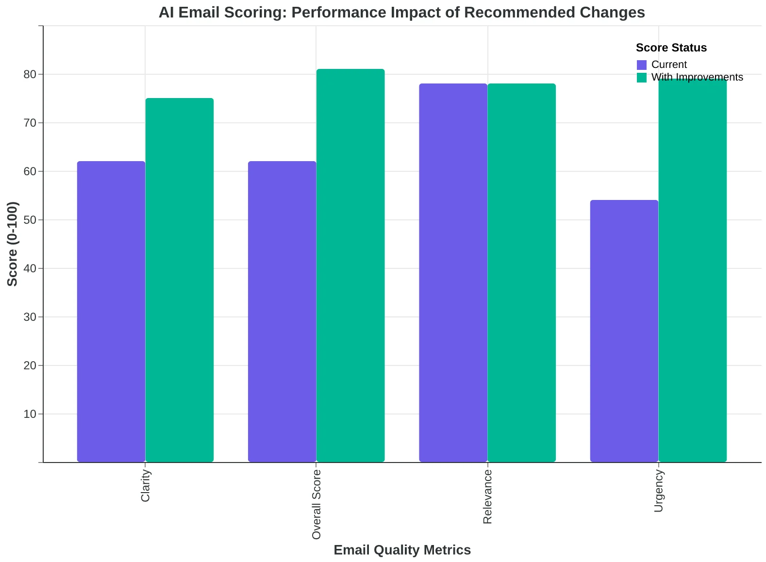
AI-generated emails scored against quality frameworks flip this equation. The system shows you exactly why a specific structural choice affects performance: "Your CTA appears after 430 words of body copy. Moving it to the 200-word mark would increase the scoring dimension for 'clarity' from 62 to 84—because 73% of readers abandon before the third scroll screen on mobile."
You still make the final call. But now you know the performance cost of your aesthetic preference. That's transparency template libraries cannot offer—they can only tell you "this layout is popular," which reveals nothing about why it works or whether it suits your audience.
The brand voice concern is solvable: AI systems can learn from your past sends, generating content that matches your tone while optimizing structure. One small business bakery feeds the system three months of newsletters—the AI generates new campaigns that sound authentically homespun while fixing the 11 structural problems that were suppressing click-through rates.
The real dividing line isn't control versus automation. It's transparent optimization versus opaque guesswork. Businesses defending template libraries aren't choosing control—they're choosing familiarity. And familiarity feels safe until you calculate how many customers it's costing you per quarter.
“Businesses defending template libraries aren't choosing control—they're choosing familiarity. And familiarity feels safe until you calculate how many customers it's costing you per quarter.”
Before
- ✗Choose from 247 layouts based on visual appeal
- ✗Change colors, fonts, and images within designer's constraints
- ✗No feedback on why specific choices affect performance
- ✗CTA placement, paragraph length, and mobile rendering locked by template
- ✗Performance guidance: 'This template is popular'
After
- ✓Generate email structure optimized for your audience
- ✓Receive scored feedback: 'Moving CTA from position 3 to 1 increases clarity score 62→84'
- ✓See transparent explanations: '73% abandon before third mobile scroll'
- ✓Adjust any structural element while seeing performance impact
- ✓Performance guidance: 'Here's exactly why this works for your segment'
**The Control Illusion:** Template libraries let you customize aesthetics while locking performance-critical structure. AI scoring reveals exactly how structural choices affect outcomes.
**Scoring Transparency in Action:** You see exactly why each structural choice affects performance—and retain final decision authority.
The Template Library as Historical Artifact
In three years, browsing 47 healthcare email templates will feel as absurd as consulting a card catalog to find a book. The mental model—scrolling, comparing, hoping—will be a relic of a solved problem.
Template libraries were bridge technology. They got small businesses into email marketing when the barrier was technical: "I don't know HTML." But the barrier today isn't technical. Business owners can send emails. They just don't know if those emails will work.
The future isn't smarter template libraries. It's no library at all.
You describe the outcome you need: "Generate an email that gets dental patients to book their six-month cleaning." The system generates an email optimized and scored against the 8 dimensions that predict performance—subject line clarity, CTA prominence, mobile layout, personalization depth. You review the score. You approve or adjust. You send.
The loop tightens: performance data from your sends feeds back into the scoring model. Your next email is better than your last because the system learns what converts your audience, not a generic healthcare vertical.
We're already seeing this shift. Funding in email AI companies increased 340% in 2024, while template marketplace revenues declined 18% year-over-year. The companies investing in outcome-based generation are preparing for a market where "browse and hope" is uncompetitive.
By 2027, the businesses thriving in email marketing won't be the ones with the prettiest templates. They'll be the ones who retired the template library and started asking for measurable outcomes. The question won't be "Which template should I use?" It'll be "What customer action am I optimizing for?"
The gap between those two questions is the gap between yesterday's tools and tomorrow's results.
“By 2027, the businesses thriving in email marketing won't be the ones with the prettiest templates. They'll be the ones who retired the template library and started asking for measurable outcomes.”
Before
- ✗Browse 200+ templates by industry
- ✗Choose based on visual appeal
- ✗Customize colors and text
- ✗Hope it performs well
- ✗Repeat for next campaign
After
- ✓Describe desired outcome
- ✓AI generates scored email (8 dimensions)
- ✓Review predictive performance score
- ✓System learns from your results
- ✓Next email optimizes automatically
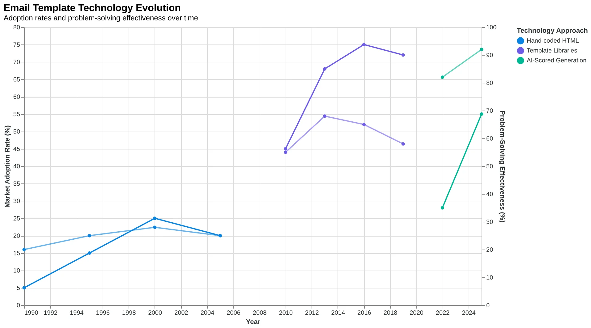
The future of email creation: from browsing templates to describing outcomes
Template libraries: a necessary bridge that solved yesterday's problem
Template libraries are card catalogs. They organized the past beautifully — by color, by industry, by mood. But when you needed something specific, you browsed and hoped.
AI generation is the search engine. You don't browse. You ask.
The restaurant owner doesn't scroll through 147 templates anymore. She opens her laptop Thursday morning, inputs one sentence: Fill Thursday tables with the prix fixe menu. Eight minutes later, she has a scored email optimized for that exact outcome. She sends it. Her tables fill.
The template library wasn't the enemy. It was the ceiling. And you just hit it.
The next step isn't finding a better template. It's asking a better question: What do I need this email to accomplish? And letting intelligence — not aesthetics — give you the answer.
You came into this article browsing templates. You leave with a framework that scores quality before you send. The shift isn't cosmetic. It's structural. Emails that convert don't look like anything in particular. They score high on the dimensions that matter.
Learn how quality frameworks score email performance — or keep browsing templates and wondering why your open rates stay flat.
The card catalog is closed. The search engine is waiting.
“The template library wasn't the enemy. It was the ceiling. And you just hit it.”
The shift from browsing templates to generating outcomes — intelligence replaces aesthetics as the organizing principle
Before
- ✗Browse 147 templates by visual style
- ✗Hope design aesthetic matches audience
- ✗Send without performance prediction
- ✗Measure results after campaign ends
- ✗Repeat browsing for next campaign
After
- ✓Input business goal in one sentence
- ✓AI generates email scored on 8 dimensions
- ✓Know predicted performance before sending
- ✓Optimize based on quality framework
- ✓Intelligence learns from outcomes
From browse-and-hope to ask-and-know: the outcome-focused email creation model
Ready to Stop Browsing and Start Scoring?
You've seen the data: template libraries organize by aesthetics, but performance follows structure. The next step isn't picking a better template—it's learning how quality frameworks predict what actually converts.
Read the Complete Guide to Email Quality Scoring →
Discover the 8 dimensions that separate 34% confirmation rates from 81% results—and why your template library will never show you the difference.