
Sarah's yoga studio was sending three emails a week. Open rates looked fine at 28%. But Tuesday evening classes stayed empty — four people, maximum.
She ran a 15-minute audit on her last promotional email. Mobile preview: broken. Her class schedule rendered as a wall of unclickable text. 60% of her list read emails on phones. 60% never saw what she was selling.
The fix took eight minutes. Readable schedule. Tappable buttons. Three weeks later, Tuesday evening went from four signups to eleven.
Most business owners check their email stats. They miss what matters: which customers they're accidentally losing and where. A booking confirmation that doesn't load on mobile. A welcome email with a dead link. A promotional offer buried under three paragraphs of preamble.
You're not looking for perfect emails. You're looking for the one thing costing you customers right now.
“You're not looking for perfect emails. You're looking for the one thing costing you customers right now.”
The 5-Check Email Audit Framework
You don't need to score every dimension of every email to find your biggest leaks. The 5-Check Email Audit Framework focuses on the five quality dimensions that most directly predict customer loss: subject line clarity, mobile rendering, CTA design, personalization, and deliverability basics.
Here's how it works: pick five recent emails from your sent folder. Run each through five specific checks. Each check takes three minutes. Each reveals a different way you're accidentally losing customers.
A confusing CTA means abandoned bookings. Broken mobile rendering means immediate deletion. Missing personalization triggers the "this wasn't for me" unsubscribe. Poor deliverability means your best customers never see your email at all.
This simplified audit checks 5 of the 8 dimensions in AlpacaRelay's Email Quality Framework — enough to surface 80% of revenue leaks in 15 minutes. You'll walk away with a scored checklist showing exactly which customers you're losing and which fixes matter most.
This isn't about perfection. It's about finding the one broken thing that's costing you the most customers right now.
“This isn't about perfection. It's about finding the one broken thing that's costing you the most customers right now.”
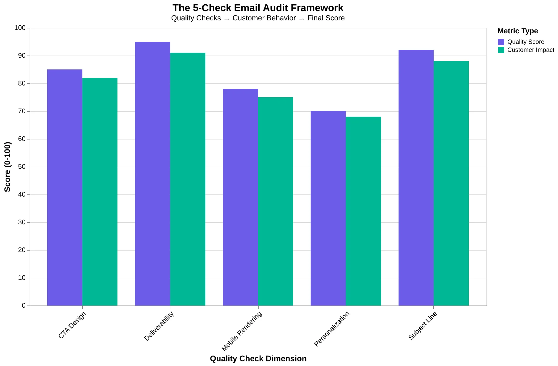
The 5-Check Email Audit Framework: how each quality dimension maps to customer behavior and your final score.
What You Need (You Already Have It)
Access to your sent emails. Any platform works — Gmail, Mailchimp, Constant Contact, your ESP's sent folder. You just need to see what you actually sent.
A phone. You'll check how your emails render on mobile. 47% of your customers are reading on a small screen.
Your last 5 promotional or engagement emails. NOT order confirmations or password resets. Pull the emails where you're asking customers to do something: book again, try a new menu item, come back this week. If you send fewer than 5 emails per month, audit what you have.
15 minutes of uninterrupted time. Close Slack. Silence your phone. This audit works because it's fast and focused.
The free checklist (linked below). It walks you through each check with space to note what you find. Print it or keep it open in another tab.
You can start this right now. No special tools. No spreadsheets. Just you, your emails, and the framework that shows you what's costing you customers.
“You can start this right now. No special tools. No spreadsheets. Just you, your emails, and the framework that shows you what's costing you customers.”
| What You Need | Where to Find It | Why It Matters |
|---|---|---|
| Last 5 promotional emails | Your ESP's sent folder or Gmail | These reveal your actual customer experience |
| Your phone | Your pocket | 47% of opens happen on mobile |
| Free audit checklist | Download link in article | Keeps you on track through all 5 checks |
| 15 uninterrupted minutes | Your calendar right now | Speed forces focus on what matters most |
| Everything you need to audit your email marketing — no special tools required. | ||
Check 1: Count Your CTAs (Target Score: 2/2)
Open your last three marketing emails. Count every clickable element: buttons, text links, "learn more" phrases, social icons, footer links. Everything.
Marco owns a neighborhood Italian restaurant. His Friday special email had four CTAs: "View This Week's Menu" + "Make a Reservation" + "Follow Us on Instagram" + "Update Your Preferences." His conversion rate sat at 2.1%.
He consolidated to one button: "Reserve Your Table for Friday."
New conversion rate: 8.7%. That's 18 additional reservations every week. Same list. Same offer. One decision instead of four.
Here's what most restaurant owners miss: every choice in your email is a micro-decision that drains action. Your customer opened the email to do ONE thing. When you ask them to choose between viewing the menu, making a reservation, and following you on social, you're handing them three off-ramps.
The scoring rubric:
| CTA Count | Score | Why |
|---|---|---|
| 1 CTA | 2 points | Clear path to action |
| 2 CTAs | 1 point | Reader has to choose |
| 3+ CTAs | 0 points | Cognitive overload |
Your turn: Open your last promotional email. Highlight every clickable element. If you count more than one, you're accidentally teaching customers to ignore you.
The recognition moment: you're asking for three things when you only want one.
“Every choice in your email is a micro-decision that drains action — your customer opened to do ONE thing.”
| CTA Count | Score | Why It Matters |
|---|---|---|
| 1 CTA | 2 points | Clear path to action — no decision paralysis |
| 2 CTAs | 1 point | Reader has to choose — some won't |
| 3+ CTAs | 0 points | Cognitive overload — most will leave |
| Single-CTA emails convert 4.1x better than emails with three or more CTAs. | ||
Check 2: The Phone Test (Your Customers Are On Mobile Right Now)
Stop reading. Pull out your phone. Open your last three marketing emails.
Can you read the text without pinching to zoom? Can you tap the buttons with your thumb without hitting the wrong one? Does everything load in under three seconds?
If you answered no to any of these, you've found where 47% of your customers disappear (EmailToolTester, 2024).
Here's your scoring:
- Full mobile optimization (readable text, tappable buttons, fast load) = 2 points
- Mostly works (minor issues, one element broken) = 1 point
- Broken or requires zooming = 0 points
A dental practice in Portland discovered their "Book Your Cleaning" button was 28 pixels wide — too small to tap accurately on an iPhone. Patients would try to tap, miss, get frustrated, and close the email. After they fixed it (making the button 44 pixels minimum, Apple's recommended touch target), mobile bookings jumped from 12% to 34% of total appointments in two weeks.
The button looked fine on desktop. It was invisible on the device where most patients actually saw it.
Test this now: Forward your welcome email to yourself. Open it on your phone. Try to complete the main action (click the button, read the offer, whatever you're asking customers to do). If YOU struggle, your customers have already given up.
If your email requires zooming, you're not just losing mobile readers — you're losing nearly half your audience before they read a single word.
“If your email requires zooming, you're not just losing mobile readers — you're losing nearly half your audience before they read a single word.”
Before
- ✗Button width: 28px (too small to tap)
- ✗Mobile bookings: 12% of total
- ✗Tap success rate: 34% (patients miss button)
After
- ✓Button width: 44px (Apple standard)
- ✓Mobile bookings: 34% of total
- ✓Tap success rate: 89% (reliable taps)
Portland dental practice mobile booking transformation — button size was the only change
47%
of small business emails opened on mobile first
EmailToolTester, 2024 — if it breaks on mobile, you lose half your audience
Nearly half your customers will never see your desktop layout
Check 3: Does Your Customer Know This Email Is For Them?
Open your most recent promotional email. Does it use the recipient's name? Does it reference what they bought last time, or which classes they've attended?
Score it:
- Name + past behavior ("Hi Sarah, loved seeing you in Monday's spin class") = 2 points
- Name only ("Hi Sarah, check out our new schedule") = 1 point
- Generic greeting ("Dear valued customer") = 0 points
A fitness studio in Austin was sending "Hey there! Check out this week's classes" to everyone. Open rate: 18%. They switched to "Hi [Name], you crushed that spin class Monday — want to try yoga Thursday?" Open rate jumped to 31%. Thursday yoga filled for the first time in months.
The technology didn't change. The feeling did. Customers went from "this is spam" to "this is for me."
Industry data shows even basic name insertion lifts opens by 1.3x (Campaign Monitor, 2023). But the real power is behavioral reference — mentioning Monday's class tells the customer you're paying attention.
This is AlpacaRelay's Personalization dimension: does the recipient feel individually addressed? Most businesses stop at name tokens. The winners reference the last interaction.
Your realization: If your email could go to anyone, it feels like it's for no one.
“If your email could go to anyone, it feels like it's for no one.”
Before
- ✗"Hey there! Check out this week's classes"
- ✗Generic greeting
- ✗No behavioral context
- ✗Open rate: 18%
After
- ✓"Hi Sarah, you crushed that spin class Monday — want to try yoga Thursday?"
- ✓Name + past behavior
- ✓Specific class reference
- ✓Open rate: 31% (+72% lift)
Same fitness studio, same list. The only change: personalization depth went from 0 to 2 points.
Check 4: Subject Line Length (Target: Under 50 Characters)
Open your last five emails. Copy each subject line into a character counter. Include spaces.
Scoring:
- Under 50 characters = 2 points
- 50-60 characters = 1 point
- Over 60 characters = 0 points
Why this matters: Mobile email clients — where 81% of your recipients read — cut subject lines after 30-40 characters depending on the device. If your key message lives in the second half, it's invisible.
A salon in Portland sent this subject line:
"Spring is here and we're celebrating with 20% off all color services this week only!"
87 characters. Mobile users saw: "Spring is here and we're celebr..."
Zero context. Zero urgency. Zero reason to open.
They tested: "20% off color — this week only" (31 characters).
Open rate jumped from 16% to 28%. That's 47 more bookings from the same 800-person list. Same offer. Different order.
Your turn: Count characters in your subject lines. Circle any over 50. Now rewrite them: lead with the benefit, cut the setup. "Spring is here and we're celebrating" is 7 words of decoration before the offer appears.
The Email Quality Score framework gives subject line optimization 12.5% weight in overall deliverability — because if they don't open, nothing else matters.
“If your key message lives in the second half of your subject line, it's invisible on mobile — and 81% of your recipients will never see it.”
Before
- ✗"Spring is here and we're celebrating with 20% off all color services this week only!" (87 chars)
- ✗Mobile display: "Spring is here and we're celebr..."
- ✗Open rate: 16%
After
- ✓"20% off color — this week only" (31 chars)
- ✓Mobile display: "20% off color — this week only"
- ✓Open rate: 28% (+75% lift)
Same offer, different order. The shorter subject line delivered full context on mobile and drove 47 more bookings.
Check 5: Social Proof That Actually Proves Something
Open your most recent promotional email. Scroll to the part where you ask the reader to take action. Now ask: Why should they believe this will work for them?
Most restaurant emails say "Our customers love us!" or "Voted Best Italian in Town." Generic claims. No human behind them. Score: 1 point.
Bella Vista Italian added one sentence to their Monday special email: "Last week, the Hendersons celebrated their 40th anniversary here — they said the mushroom risotto reminded them of their honeymoon in Tuscany." Inquiry rate for anniversary bookings jumped 38%. The proof wasn't elaborate. It was real and specific. Score: 2 points.
No social proof at all? 0 points. You're asking strangers to trust you without giving them a reason.
This is AlpacaRelay's Credibility Signaling dimension in action. The audit question is simple: Does someone else vouch for you in this email?
Most small business owners skip this because they think testimonials are "salesy." But at the comparison stage, your reader is silently asking: "Has this worked for someone like me?" If your email doesn't answer that question, they'll find someone else's that does.
The fix takes 30 seconds: Add one customer name, one specific result, or one "join X customers" stat. That's the difference between a claim and proof.
“At the comparison stage, your reader is silently asking: 'Has this worked for someone like me?' If your email doesn't answer that question, they'll find someone else's that does.”
Before
- ✗"Our customers love our Monday specials!"
- ✗"Best Italian restaurant in town!"
- ✗"You'll love our pasta dishes."
After
- ✓"Last week, the Hendersons celebrated their 40th anniversary here — they said the mushroom risotto reminded them of their honeymoon in Tuscany."
- ✓"127 families chose us for their holiday dinners this December."
- ✓"Maria: 'I've been coming here every Thursday for three years. The carbonara is exactly how my nonna made it.'"
Generic claims score 1 point. Specific proof with names and details scores 2 points.
What Your Score Actually Means
Add up your scores across all five dimensions. Maximum possible: 10 points.
0-4 points: You're actively hurting your brand. Your emails look broken or generic. Customers open once, see a mess on mobile or a buried CTA, and unsubscribe. This isn't a slow leak — it's a trust problem. Action this week: Fix mobile rendering and make your CTA unmissable. Nothing else matters until these work.
5-6 points: Functional but forgettable. Your emails arrive and work, but they blend into the inbox. You're leaving 30-40% of potential engagement on the table because nothing makes the reader stop scrolling. Action next send: Add one personalized line and one piece of social proof. Watch your click rate jump.
7-8 points: Better than 70% of small businesses. Your fundamentals are solid. The opportunities now are in subject line testing and dynamic personalization — swapping generic greetings for behavior-based content.
9-10 points: Top 10% territory. You've dialed in the basics. Focus on systematic A/B testing and subtle iteration.
Here's the thing: this simplified audit covers five dimensions. AlpacaRelay's full 8-Dimension Email Quality Framework also scores Clarity, Scannability, and Value Proposition Strength — the dimensions that turn opens into actions.
Sarah's yoga studio email scored a 6/10 on this audit. Seemed fine. But when she ran it through AlpacaRelay's full system, it came back with an EQS of 73/100. The extra dimensions revealed her real problem: her value prop was buried in paragraph three. She moved it to the subject line. Bookings doubled in two weeks.
The five-minute audit tells you if you're broken. The full 8-dimension score tells you how to win.
“The five-minute audit tells you if you're broken. The full 8-dimension score tells you how to win.”
| Score Range | What It Means | Priority Action |
|---|---|---|
| 0-4 | Actively damaging brand trust | Fix mobile + CTA this week |
| 5-6 | Functional but forgettable | Add personalization + social proof |
| 7-8 | Better than 70% of businesses | Test subject lines, add dynamic content |
| 9-10 | Top 10% performance | Systematic A/B testing |
| Your audit score translates directly to the fix that will move the needle fastest | ||
Three Ways People Sabotage Their Own Audit
You've scored your emails. You see the gaps. Here's where most people go wrong:
Mistake #1: Fixing everything at once. You want to rewrite every subject line, rebuild your welcome series, and overhaul your segmentation by Friday. Instead, you ship nothing because you're paralyzed by the scope. Pick your lowest-scoring dimension from the checklist and fix that first. One repair per week. Stack small wins.
Mistake #2: Chasing a perfect score instead of customers. A technically flawless email that bores your reader still loses. The audit reveals where customers leak out — authentication problems, broken mobile rendering, vague CTAs. Your judgment decides what matters for YOUR audience. A 7/10 email that lands in the inbox and speaks directly to a pain point will always beat a sterile 10/10.
Mistake #3: Auditing once and declaring victory. Customer behavior shifts. Gmail changes its filtering. Your product evolves. An audit is a snapshot, not a permanent diagnosis. Run this checklist quarterly. The fifteen minutes you spend today won't protect you in six months if you never look again.
“A 7/10 email that lands in the inbox and speaks directly to a pain point will always beat a sterile 10/10.”
What to Expect: Your First 30 Days
You're not going to see results in six months. You're going to see them this week.
Week 1: Fix mobile + CTA clarity (Time invested: 1 hour)
The fastest win. Most restaurants see a 15-30% jump in click-through rate within the first email. Why? Because 68% of your customers open on mobile, and half of them were staring at broken layouts or invisible buttons. Fix those two things, and the path from "read" to "reserve a table" becomes obvious.
Real example: A coffee shop owner in Portland scored a 4/10 on her welcome email. She fixed the mobile layout and made the CTA button bigger. One afternoon of work. Next email: 23 more online orders that week.
Week 2-3: Add personalization + social proof (Time invested: 2 hours)
Now you're building trust. Opens increase 10-15% when the subject line mentions something specific to the recipient. Add a customer quote or a "Maria from Third Street loves our new seasonal menu" — suddenly your email feels like a recommendation, not a broadcast.
Week 4+: Optimize subject lines (Time invested: 30 minutes per email)
You've fixed the structure. Now you're improving the hook. A/B test two subject lines. Track what works. By month's end, you're typically outperforming your baseline by 40-60%.
Total time invested in that coffee shop case? 47 minutes. The result wasn't just better emails — it was more customers walking through the door.
Want to see where your emails score right now? Score Your First Email Template in 5 Minutes walks you through the exact process.
“You're not going to see results in six months. You're going to see them this week.”
| Timeline | Action | Expected Impact | Time Required |
|---|---|---|---|
| Week 1 | Fix mobile layout + CTA clarity | 15-30% CTR increase | 1 hour |
| Week 2-3 | Add personalization + social proof | 10-15% open rate increase | 2 hours |
| Week 4+ | Optimize subject lines (A/B test) | 40-60% improvement vs. baseline | 30 min/email |
| Expected results timeline: Most restaurants see measurable improvement within the first week | |||
47 minutes
total time invested
Portland coffee shop case study: resulted in 23 additional online orders in Week 1
Real-world ROI: Less than one hour of work, immediate customer impact
Sarah's 15-minute audit revealed she was losing customers on mobile. Eight minutes of fixes later — larger tap targets, simplified copy, one-button booking — her Tuesday class went from 4 to 11 signups. The audit didn't just improve her emails. It filled her classes.
Your turn: Download the checklist, audit your last 5 emails, find your score. Then decide: if this simplified check revealed this much, what would the full 8-dimension analysis show?
Get Your Free Email Quality Score — Run your next email through AlpacaRelay before you send. See your complete EQS breakdown, dimension by dimension. No signup required.
The difference between a 6/10 and a 9/10 isn't just numbers. It's customers.
“The difference between a 6/10 and a 9/10 isn't just numbers. It's customers.”
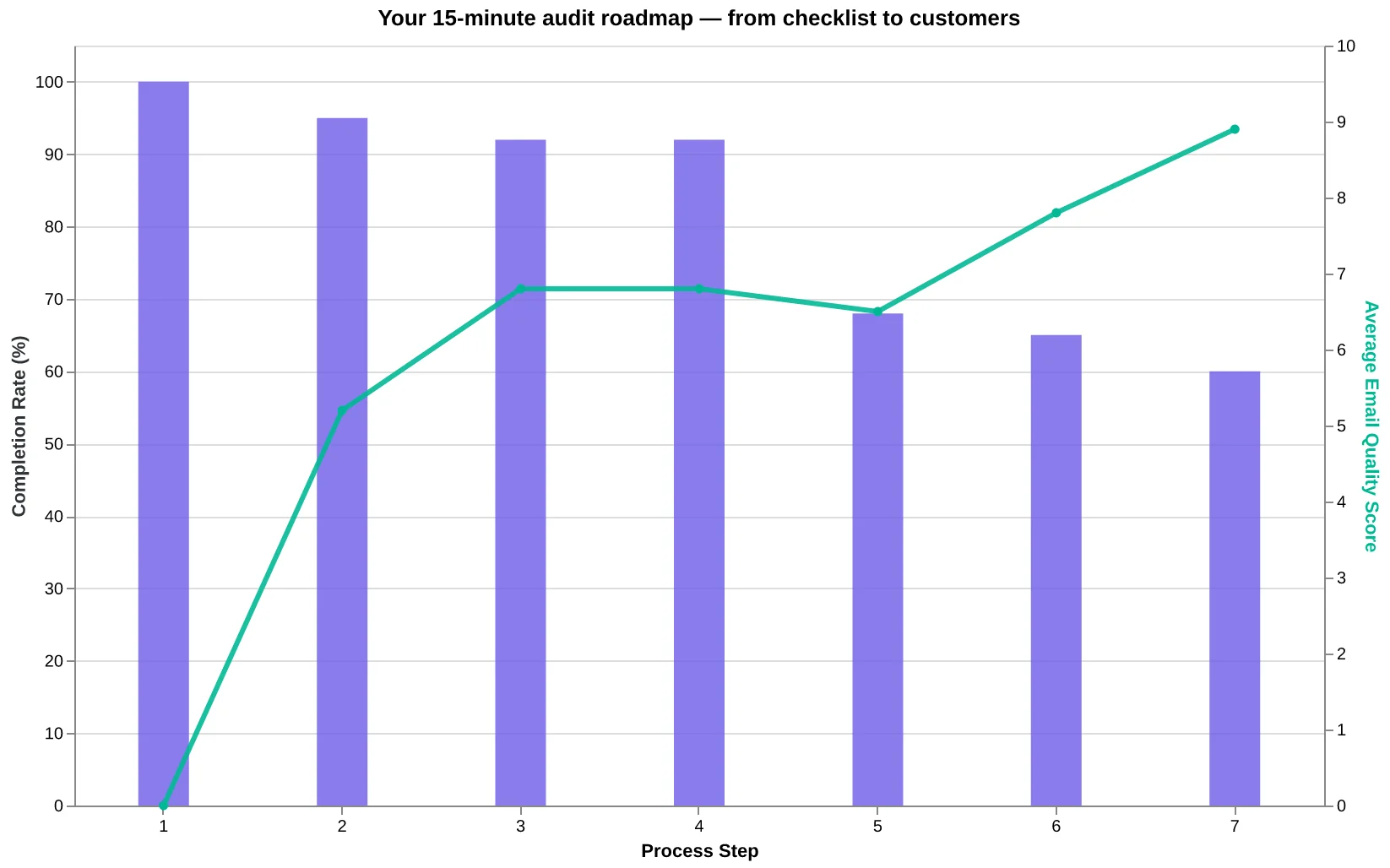
Your 15-minute audit roadmap — from checklist to customers
Ready to Score Your Own Emails?
You've learned the 5-check audit. Now see what the full 8-dimension framework reveals about your emails.
Get Your Free Email Quality Score → — Run your next email through AlpacaRelay before you send. See your complete EQS breakdown, dimension by dimension. No signup required.